

Calculation Designer Examples
As described in the overview, the Calculation Designer is a point-and-click tool that enables you to easily design sophisticated and advanced calculations.
Example 1 : Build a Cross-Dimensional Calculation (basic example)
Normal custom members are usually built with wizards WITHIN a dimension/hierarchy. The calculation designer specifically allows users to create calculations ACROSS dimensions for more powerful analytics and functionality.
| Step | Result |
|---|---|
|
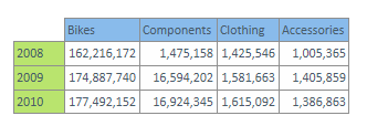
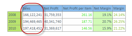
The user wants to show each cell's value of the sales metric and as a percentage of the total grid. |
|
|
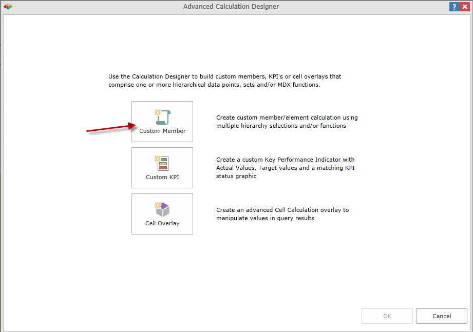
Open the ACD, choose Custom Member |
|
|
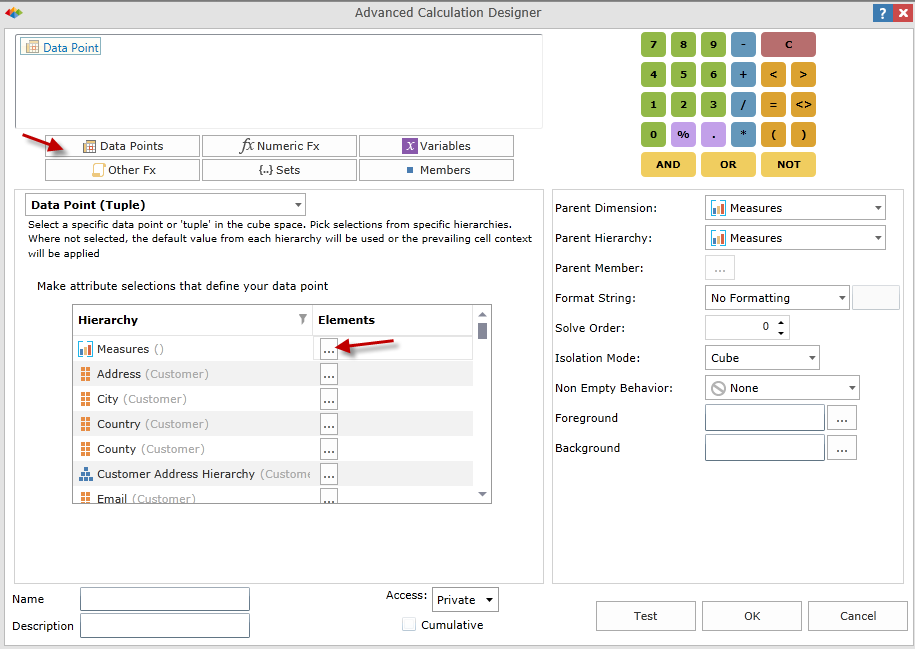
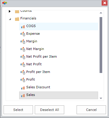
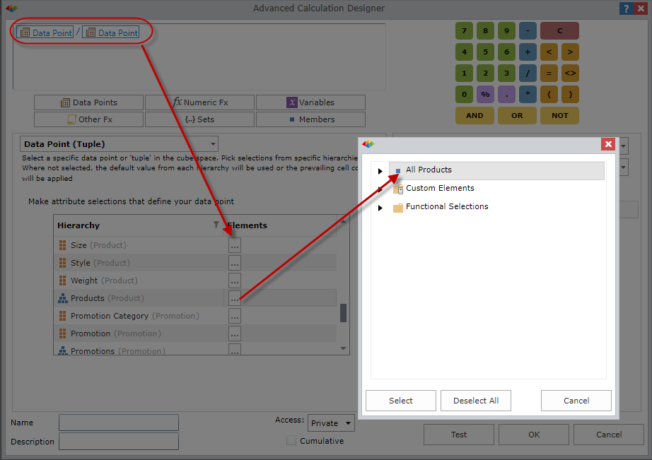
We'll create the percentage by dividing each cell (or "data point") by the total of the grid. Select a Data Point, or Tuple object and add it to the equation editor. In the selections panel below, click the ellipsis button and choose the sales measure from the element listing. |
|
|
|
|
Now complete the equation, by putting in the divide operator and another data point. This second data point will be the sales measure again AS WELL AS the members "All Dates" from the date dimension and "All Products" from the product dimension. The cell representing these 3 elements is the 'total' of the original grid, which is what we need to determine the denominator of the percentage. |
|
|
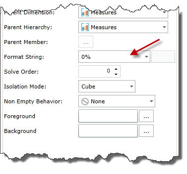
Next, set the formatting string for the new calculation: Percentage. Also, we want this to be a new measure, so we leave the parent dimension as "measures". |
|
| Name the new custom member and decide whether it will be private or shared. |

|
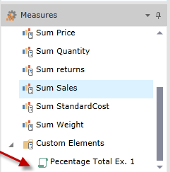
| You can now find the custom member in the main Data Discovery interface under the dimension to which it was saved. Click on it and the Pyramid icon to execute. |
|
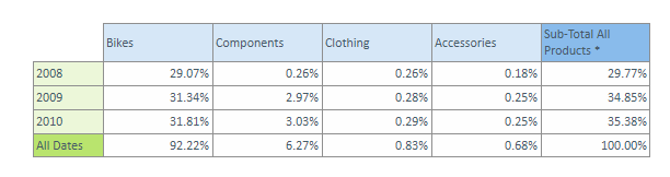
| The query will then run against the grid and return the percentage results. Turning on visual totals, will also highlight the total of each column and/or row as a percentage of the total. |
|
Example 2: Creating a Cell Overlay (advanced example)
Normal custom members usually create new members for existing dimensions that represent new calculations or generated values for those virtual, calculated members. Cell Overlays, on the other hand, do not CREATE new members, but instead change the values of cells (tuples/data points) to the value generated by the given equation. Cell Overlays are therefore more powerful and can be used to "overwrite" inherent data content based on logic or value. The best example of cell overlays is to use it for "what-if" analysis.
| Create a Cell Overlay that shows what happens if the sales measure increases or decreases - how will it effect the other profit metrics. |
|
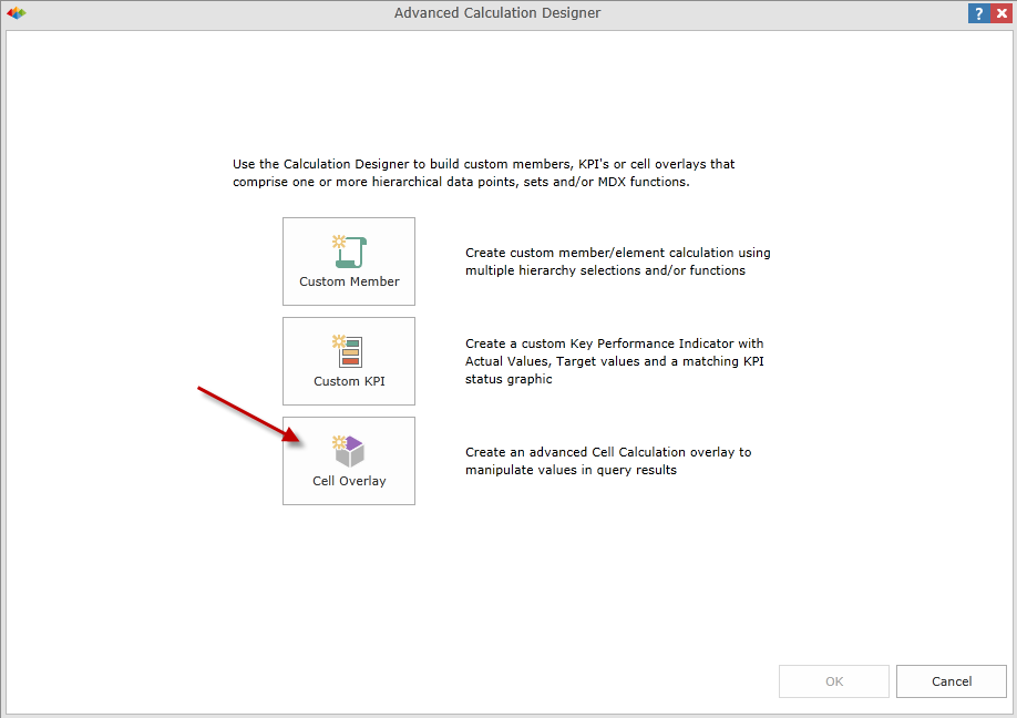
| Click on the Calculation Designer from the Query tab, and select Cell Overlay. |
|
|
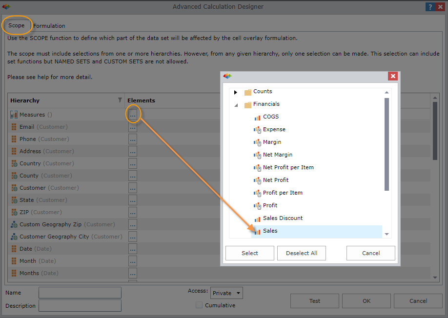
Select the Scope for the Cell Overlay - in this case the Sales.
"Scope" represents the set of cells we want to change with the overlay. In this case, we want to change any cells that use the sales measure.
The scope can be made more specific by choosing more elements from the different dimensions. |
|
|
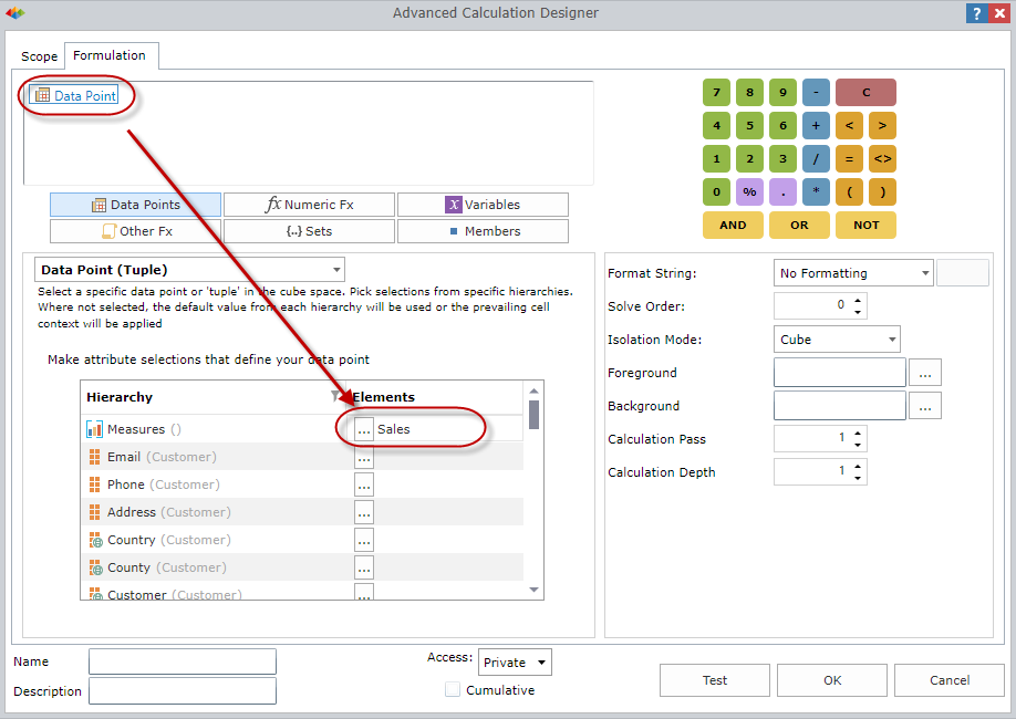
Then go to the Formulation tab to create the equation that will be used to change the value of the cells defined by the Scope.
The formulation can be a static number to create a hard overwrite effect (like '1000' to make all sales figures set to 1000). More often, its a numeric calculation that can generate intelligent values based on logic.
In this case, we will set the value of sales to itself multiplied by a variable amount that the end user can play around with in the reporting interface.
So add a Data Point that is the sales measure itself. |
|
|
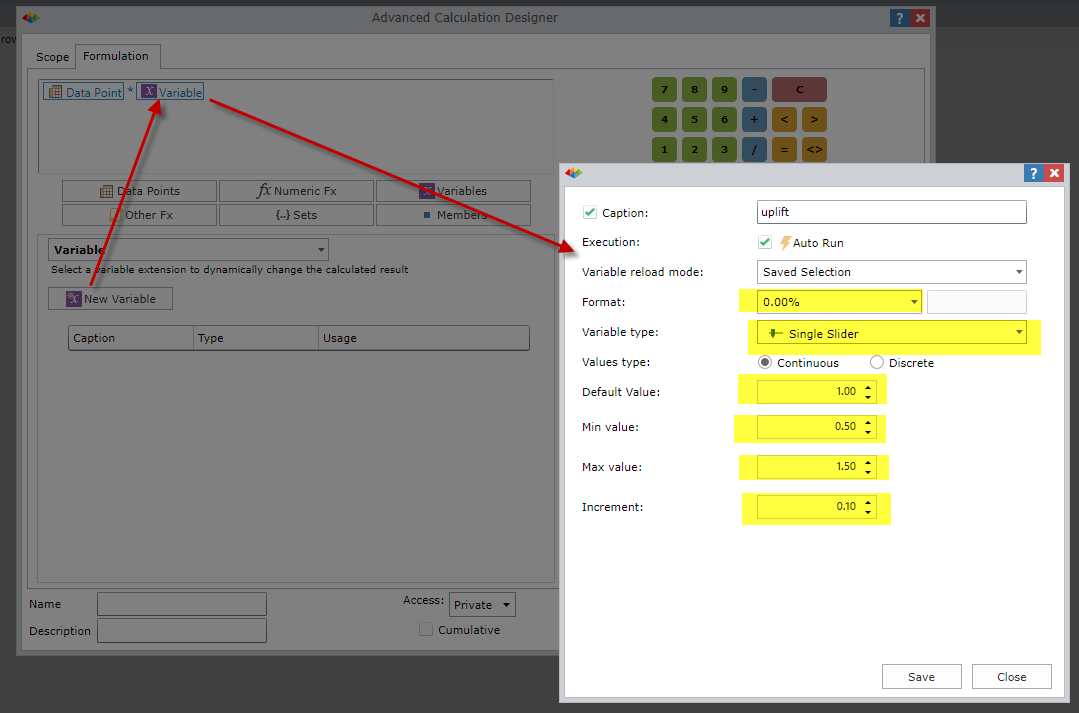
Now we amend the formulation to be the sales data point multiplied by a variable change. Add a variable to the equation then click "New Variable" to create the variable options.
Set the variable as a percentage slider with a default of "1", minimum of 0.5, maximum of 1.5 and increments of 0.1. This will allow the end users to tweak sales by a range of 50-150% in steps of 10%.
|
|
|
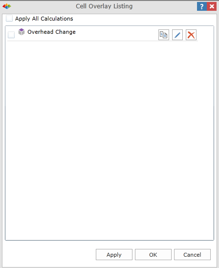
Click OK to save the Cell Overlay. You are then prompted to enable the new cell overlay calculation.
Check the box next to your new cell overlay to apply it.
|
|
|
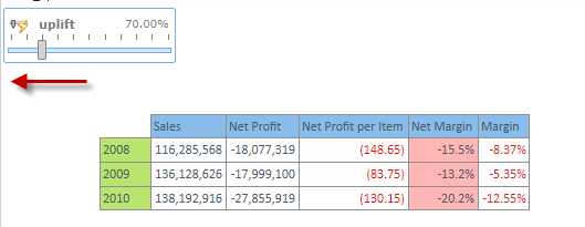
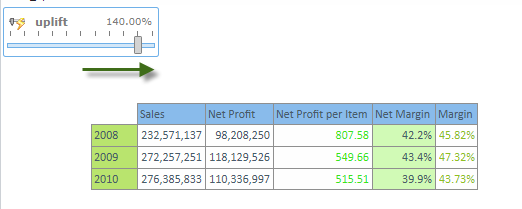
In the report, you'll see a slider appear (because of the variable) which will allow you to tweak the sales figures in the original grid.
Because the other metrics are all based on the sales figures, the entire set of metrics will change when you change the value of the sales values. |
|
Home |
Table of Contents |
Index |
User Community
Pyramid Analytics © 2011-2022